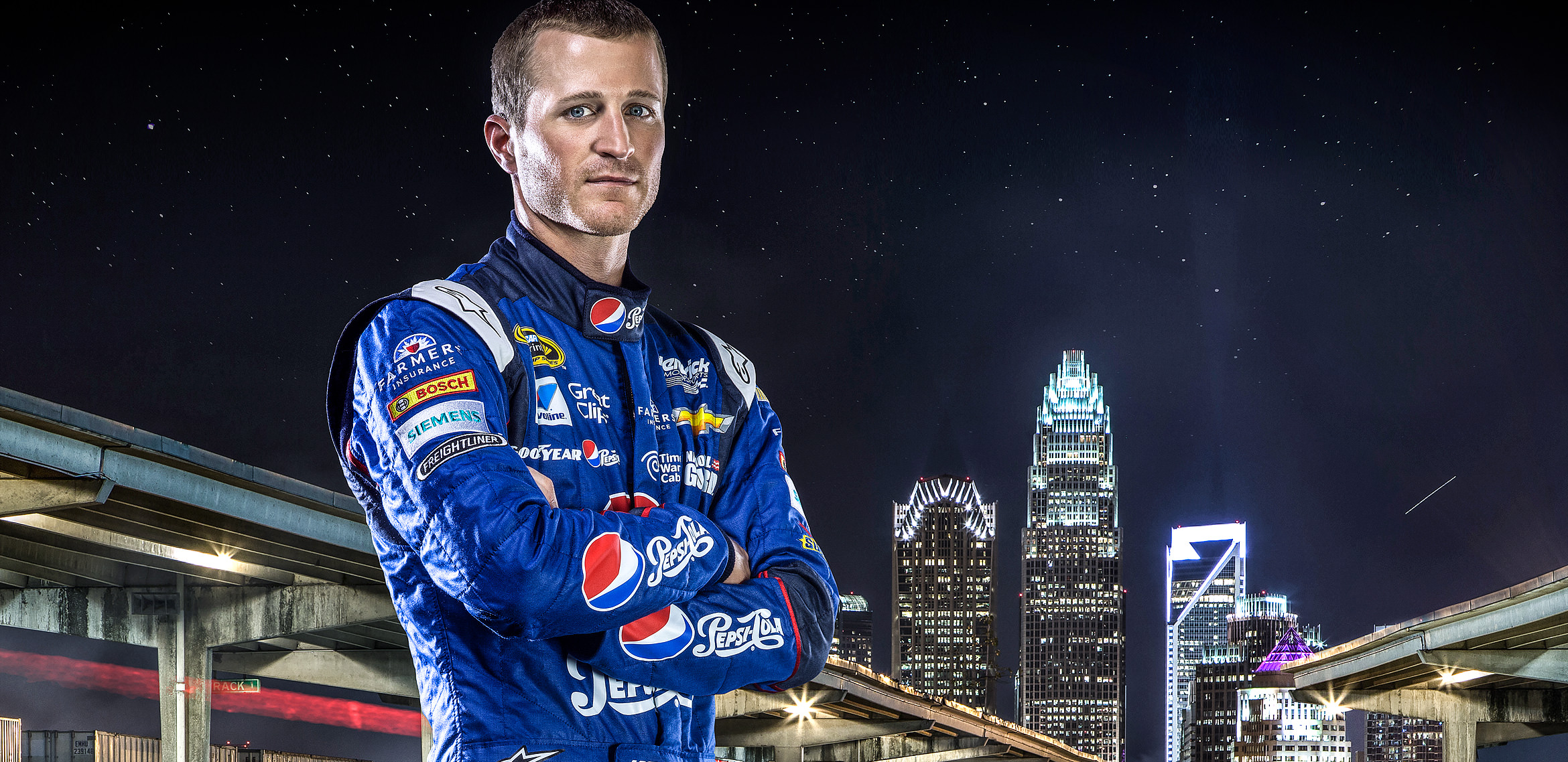
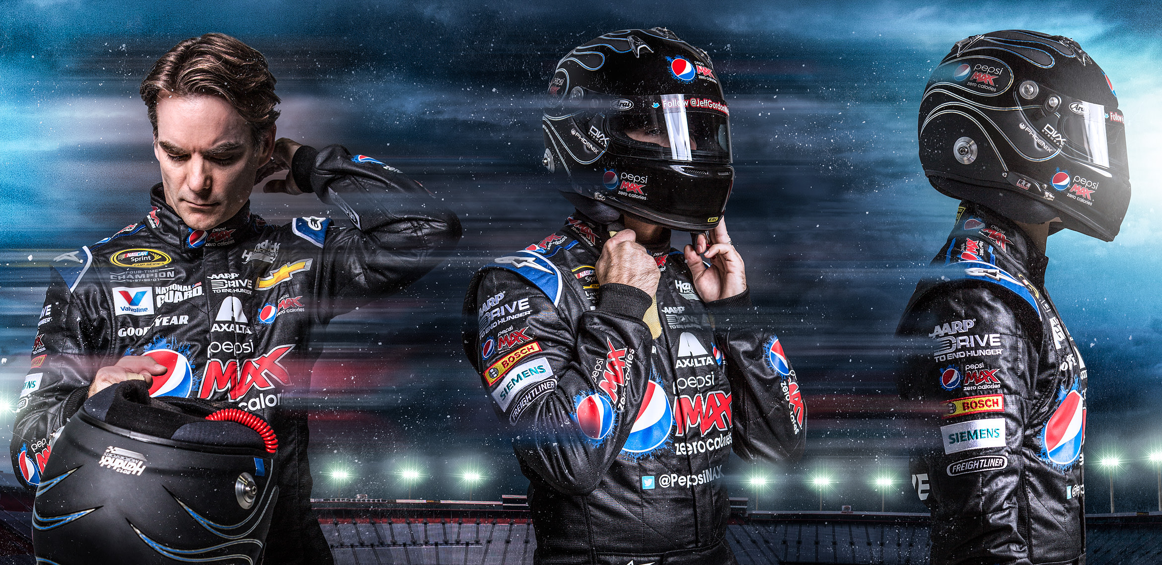
Nearly 4 years have passed since my previous mailer. And let me tell you, a LOT has happened since then. My photography has matured, received more work, and made connections with bigger clients such as Mercedes-Benz, BMW, Pepsi, KFC, Porsche, STA-BIL, Harley-Davidson, etc. And now, I felt the time has come to accumulate my latest work and show it off… but if you know me, I don’t do simple.
Five years ago I had a desk job as an Art Director for multiple national magazines, which fortunately gave me a front row seat to photographers and illustrators sending me promotional mailers. Most were useless non-personal postcards or emails, but every now and then I got something that forced me to stop and look. As with anything when trying to find new business, you must be in the mindset that the people you want to contact, have no idea who you are. And that’s OK. But don’t make the mistake of only letting your work naturally fall in front of the right eyes, instead give it a push. I see it as my job to advertise myself. Considering the size of the agencies I’m sending these to, and the vast ocean of talented photographers available in the world, I had better make my first impression a good one.
The idea started out as expanding on my previous “GIVE ME A SHOT” mailer, but in a much more polished and mature way. I eventually thought of having bullet holes going through multiple prints at the same location, so when they’re stacked together it would make a noticeable concise hole. To take the idea even further, I thought it would be cool to include a bullet shell within the mailer to solidify the idea that each print has been “shot”. Get it?… OK don’t let me lose you… Actually, instead of creating a wall of words and going through my thought process, watch this video and read the captions below on how these 50 mailers were pieced together:
This is it! After a year of casually brainstorming, and sourcing the elements together, this is the fruits of my labor. Certainly longer than I had anticipated, but as a perfectionist I didn’t want to make any sacrifices when conveying my work to the top agencies in the country.
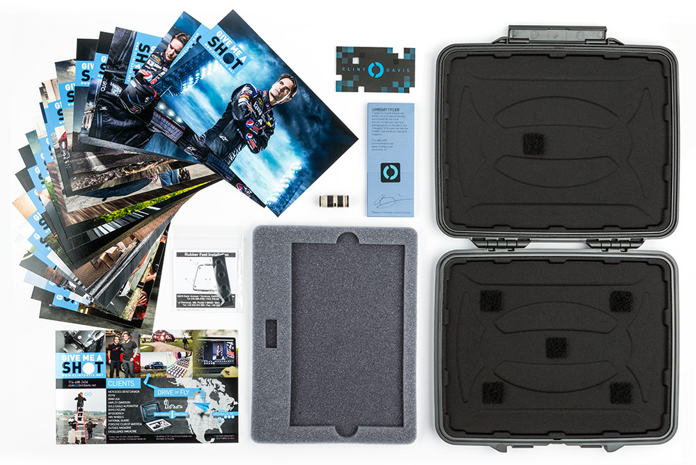
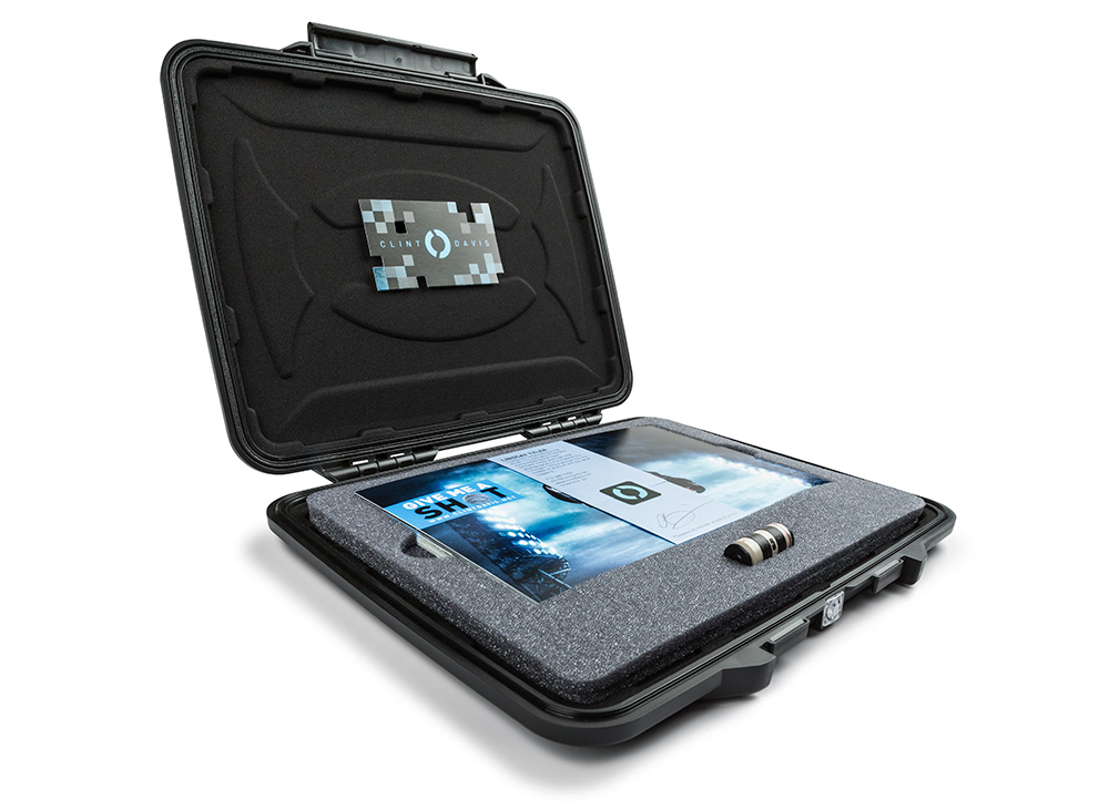
The guts of the mailer:
-Pelican case with my logo painted on the back (rubber feet included)
-20 5×7″ drilled lustre prints with 1 print detailing my contact info
-Hand painted bullet shell by my friend and local artist Christina Ramsey
-Custom foam cutout velcro’d in to precisely hold the prints, and hand painted shell
-Hand scored paper wrap with signed personalized note to recipient
-Snazzy business card
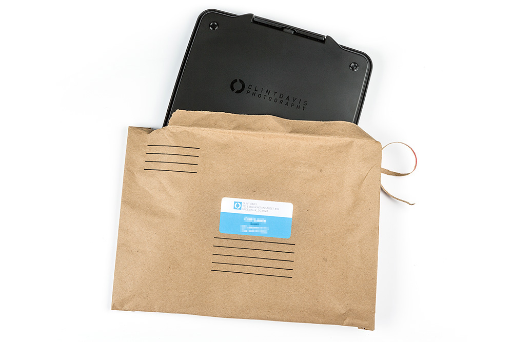
Trivial decisions like how to package and label the mailer were important, because after all, this is the first thing they will see. I went with a Caremail package because it’s rugged, yet environmentally safer than bubble wrap. I wanted the convenience of printing addresses at my office, so I rigged a way to seamlessly print Avery labels to the edge.
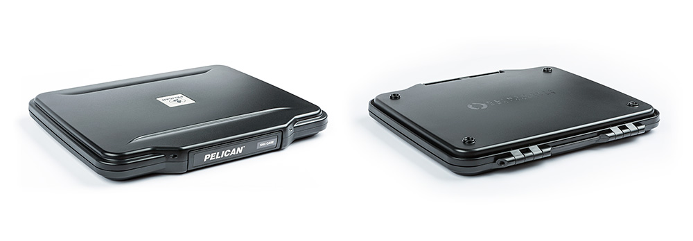
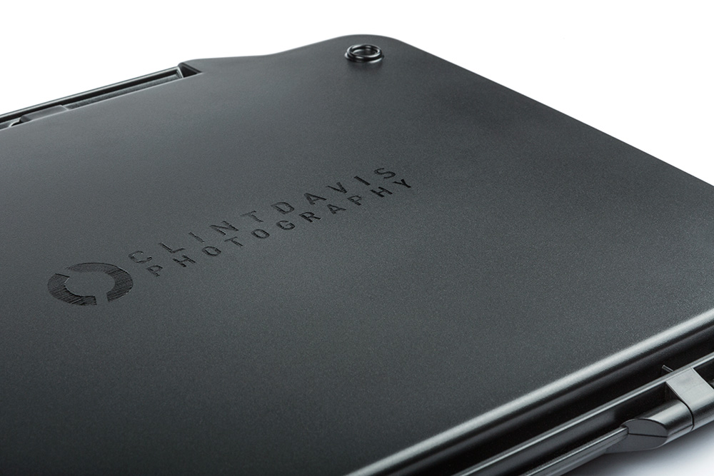
Why a Pelican case? If you’re a photographer, or remotely close to the creative world, you already know the answer. Nearly all production gear is transported within this iconic brand. A few were painted cyan and white in the beginning. They looked great, but I didn’t I didn’t want to obnoxiously SCREAM my name on the case since they would (hopefully) be keeping the functional iPad/tablet case. So I opted to paint the logo black on the back. Seems fairly simple, but look closely and you will see brush strokes. It compliments the hand painted bullet shells inside. Yes, I’m a bit insane.
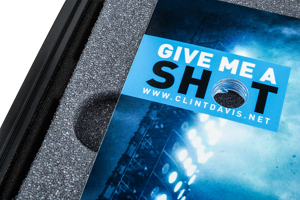
This angle shows how snug the custom cut foam fits the 21 prints, along with a convenient notch on the side for easy removal. Notice how the drilled holes in the prints aren’t laser-cut precise? That is on purpose, I wanted the prints to have a jagged look as if shot by a bullet.
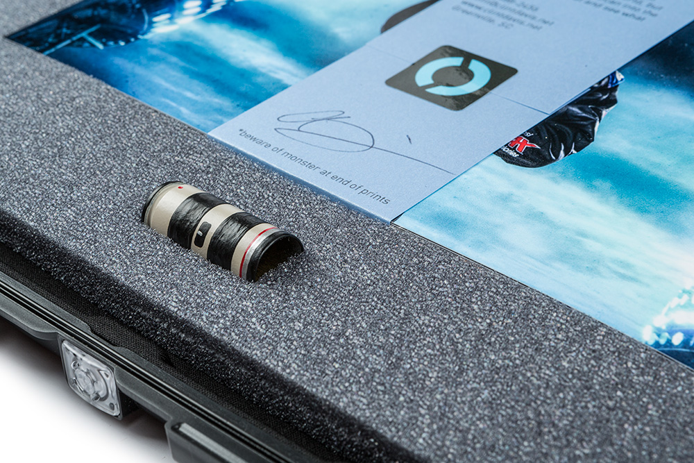
And this is the perceived culprit of the jagged holes in the prints. I don’t use the Canon 70-200 2.8L lens a lot personally, but I realize it’s one of the most iconic lenses ever made, and would easily be the most recognizable. The hand painted .50 caliber shell is also snugly put on display below a personally written note to each recipient. What’s the monster at the end??? I admit it’s a shameful attempt to have the reader go through all the prints to see…
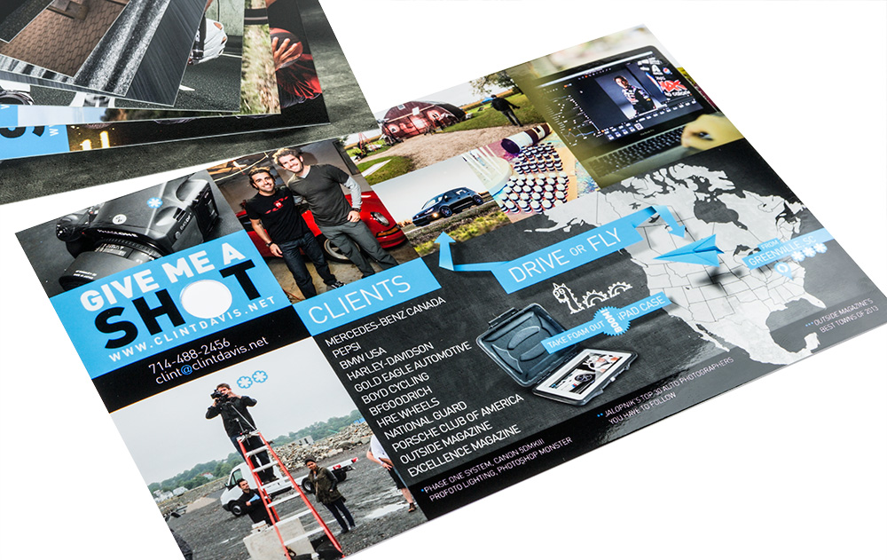
…an info print about me. It’s something to express my personality, explain where I live, my clients, fun facts, and a few pics of my adventures. Oh yea, and a little terrifying Loch Ness monster I drew with the Wacom.
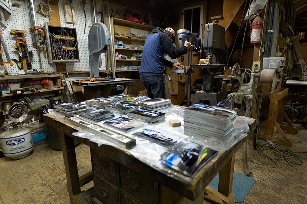
Now behind the scenes: 2,000+ prints sitting patiently in a friend’s woodshop ready to be drilled.
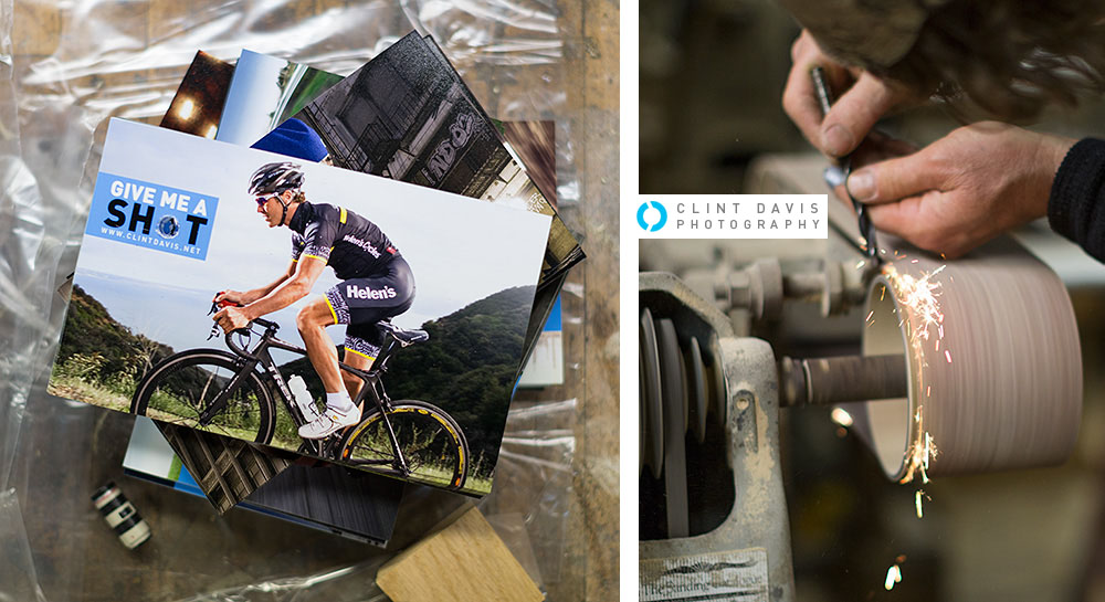
Drilling was a 2-step process. Jonathan had to use a small drill-bit, then the larger one for the final diameter, sharpening the bit every few hundred prints. Using just the final drill-bit was too much stress on the machine.
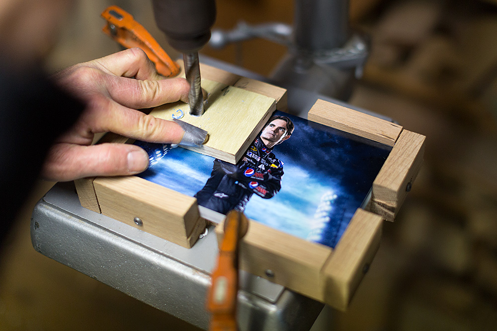
A custom template was made to stacks of 30-50 prints for accurate drilling for all 2,000+ prints. Sure enough, when the dust settled, all of the prints lined up perfectly.
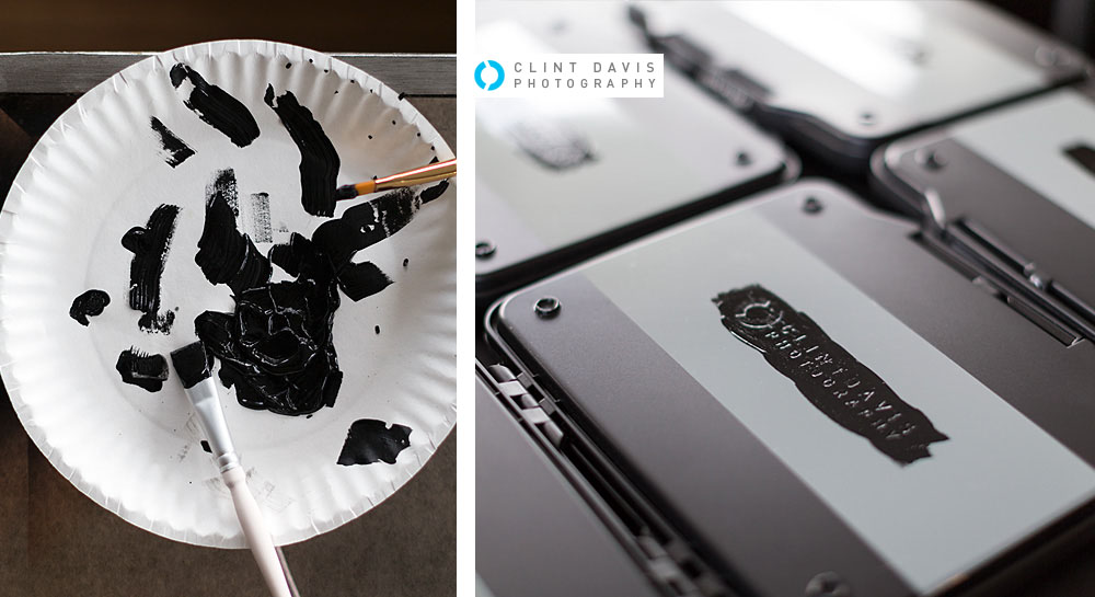
Break out the paint. Each Pelican case was stenciled with my logo on the back. I thought about just using a vinyl sticker, but paint shows a more personal permanent touch, whereas stickers are easily removed.
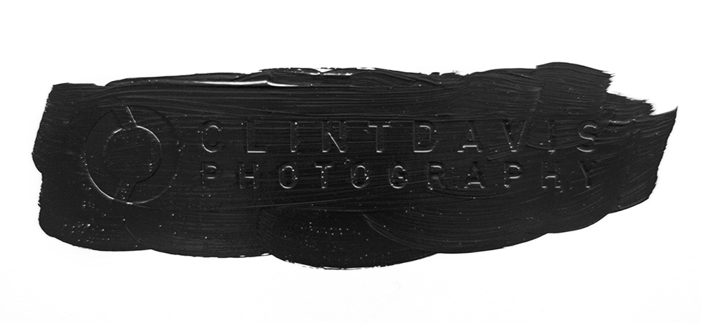
Slather on the paint, the more texture the better! Even from a few feet away, you can see the brush strokes in each letter. I let the paint dry for a good 15min before it got too hard for peeling off the vinyl stencil.
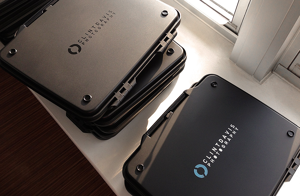
After carefully peeling off the vinyl and meticulously plucking out each “O”, “A”, “D” negative spaces with an X-ACTO knife, they were left to dry. The first few cases were painted with cyan and white. However, I thought if I wanted the recipient to potentially keep the Pelican case, then it should be more subtle.

You thought painting logos on each case took a long time? You haven’t seen anything yet! The main supporting element of the “GIVE ME A SHOT” campaign are the bullet shells painted like the iconic Canon 70-200 2.8L lens. I wanted the shells to look like the lens, but not to look too perfect as to show that each one is hand painted. Christina did an impeccable job of giving each shell enough detail to be easily recognizable, yet retain the texture that painting yields.
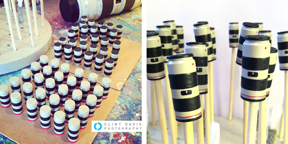
After each layer of paint, Christina rested each one on a stick to dry.
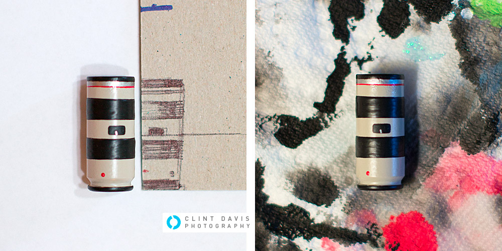
To make sure each shell was painted nearly the same, Christina drew a handy template. The attention to detail is maddening. Everything from the base off-white color of the lens, the silver/red line, to the red dot… I was breathless when she showed me the final results.
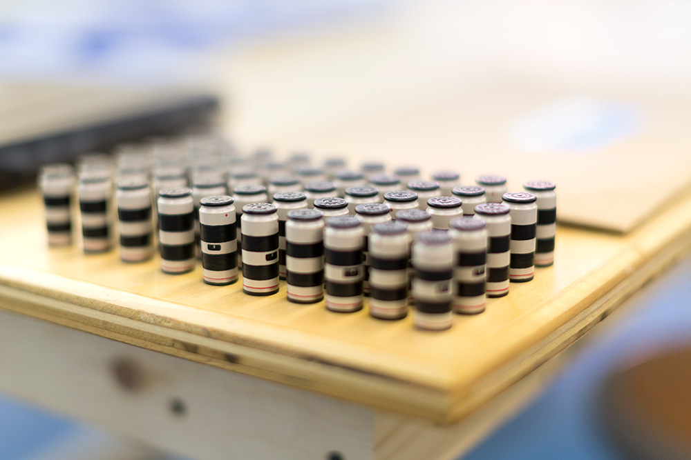
Lined up like good little stormtroopers (sorry I had to) and ready to be pieced together for each mailer.
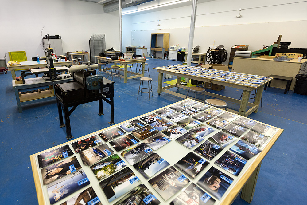
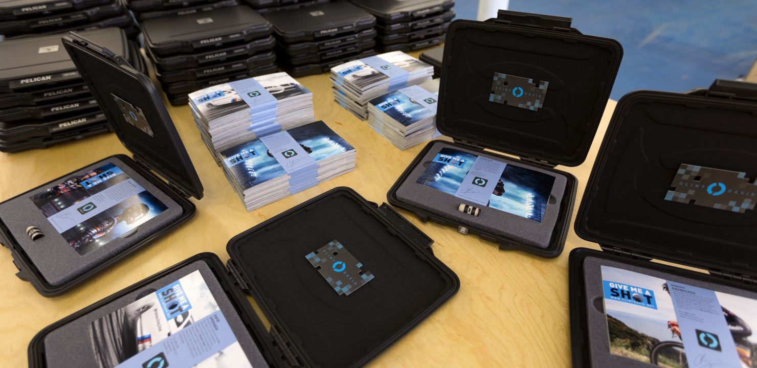
The Printshop was kind enough to lend me their HUGE space in Greenville, SC for 2 days to piece together every mailer…
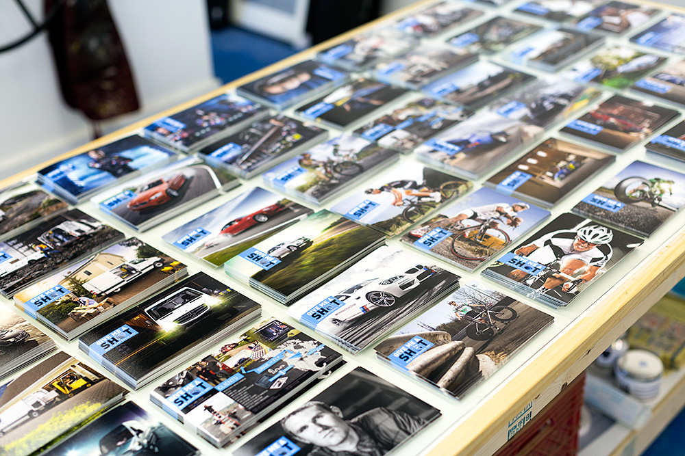
…And lots of space is what I needed! Each recipient receives 20 prints, but each mailer is not the same. For instance, if I’m sending a mailer off to an agency that represents Cannondale bicycles, then most of the prints will be aimed at cycling and sports. If another one is aimed at an agency that works with a truck brand, then most of the prints will be the Mercedes-Benz Sprinter campaign.
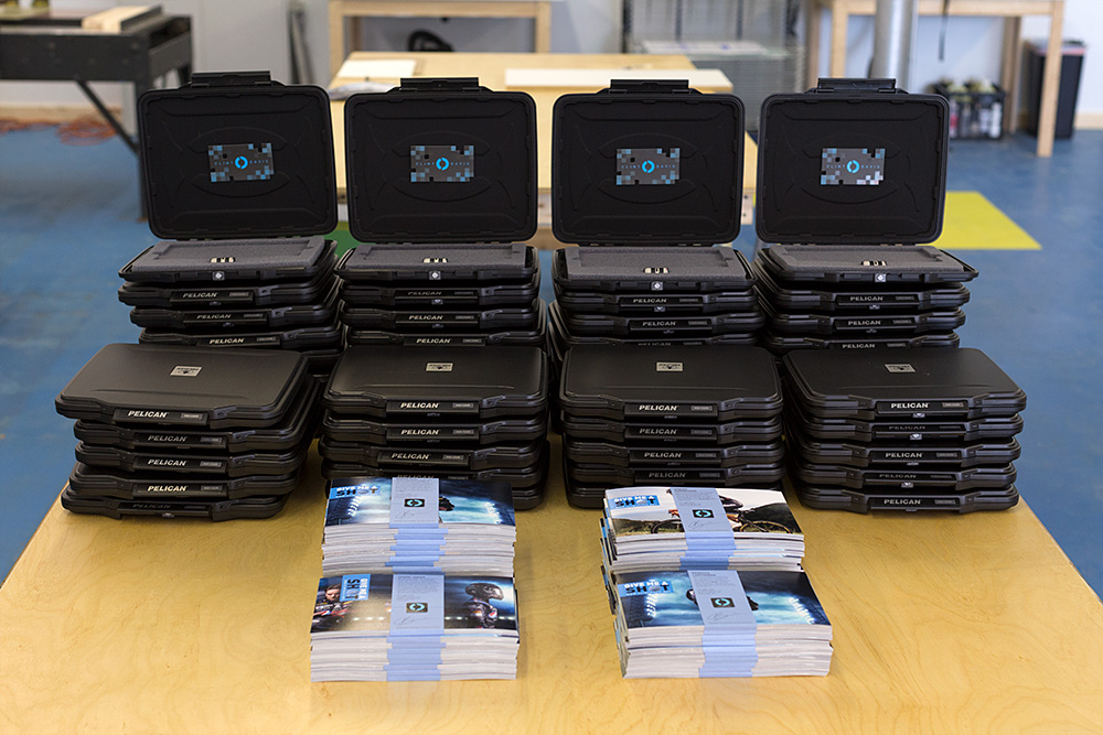
After matching the personalized wraps with their unique set of 20 prints, bullet shell placed, and a business card velcro’d to the inside, they were ready for the final stage.
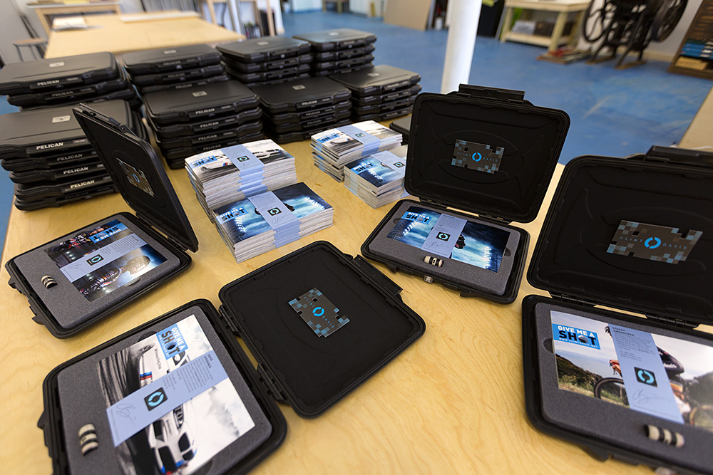
And that’s it. Each mailer is personalized to each recipient. What is your reaction when you receive a letter in the mail that is addressed to “Or Current Resident”?… Exactly, most of the time it goes straight to the trash. If I’m going to make a first impression, I want it to be personal, impressive, and above all, memorable.
Many thanks goes out to the patient, and overly helpful Sarah (and our friend Leize). My friend Jonathan did an outstanding job drilling a precise hole in 2,000+ prints. Christina Ramsey blew me away with her attention to detail on the painted shells. And The Printshop for their huge workspace to organize all the pieces. Riker, the dog, however didn’t help much at all. He just sniffed everything. Thanks for nothing, Riker.

