To sum up 2015, I put together yet another promo mailer to send out to current and prospective clients. If you’re familiar with my first and second promo mailers, you know by now I’m a tad obsessive about these things… however this time, I think I hit the sweet spot when it comes to being affordable, eye-catching, and practical.
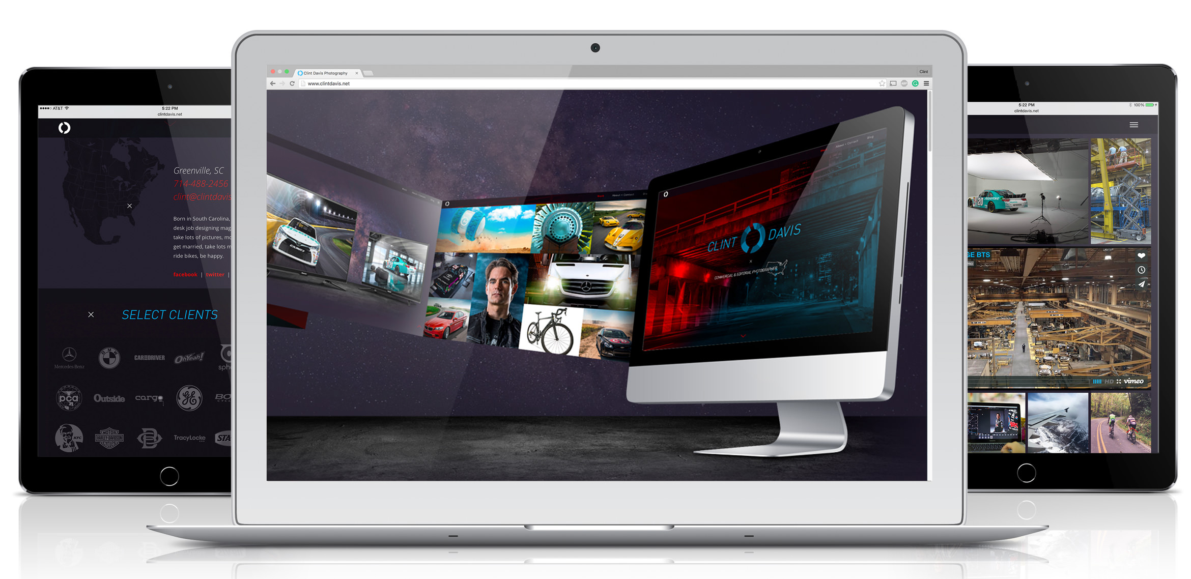
The whole point of this mailer is to capitalize on my 2015 work. In 2015 I redesigned the very blog you’re reading, totally revamped my ever-so-important portfolio website, updated ALL of my social outlets (Instagram, Facebook, Twitter, Behance, Linkedin), and did a big push with BTS videos thanks to Will Keown. Whew! From my experience, owning a photography business is much more than just pushing a shutter button.
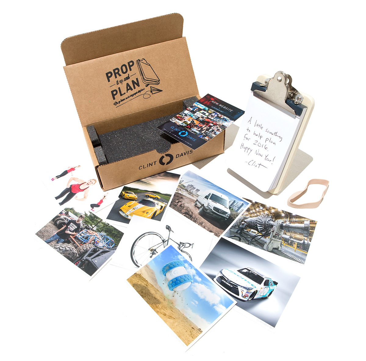
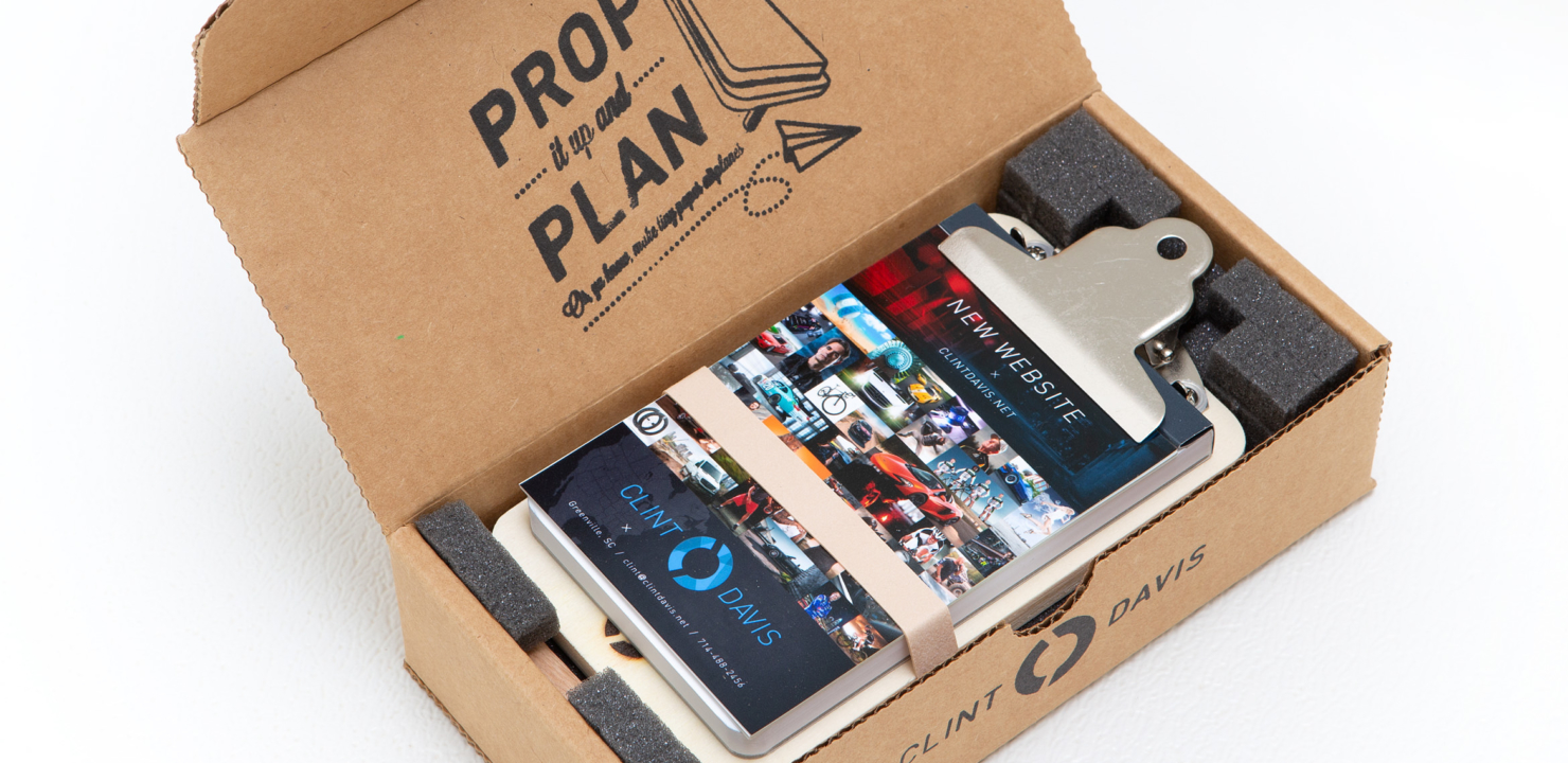
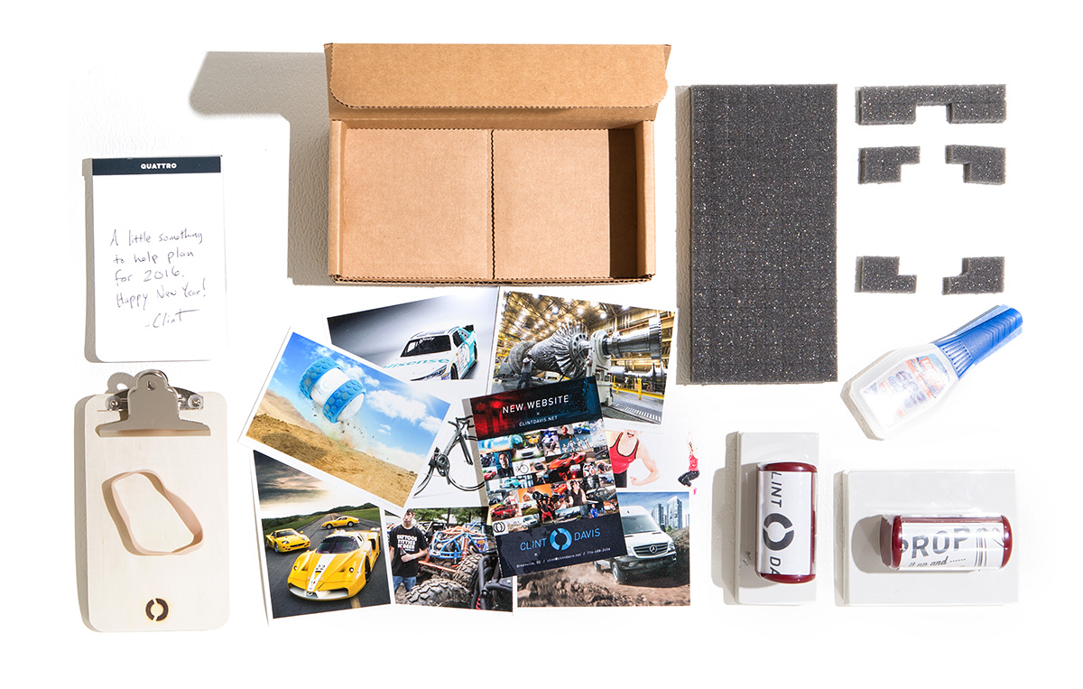
So here it is. It’s basically a stand-up mini clipboard with a notepad and a few select prints. In all likelihood, the prints will be looked at and eventually tossed during spring cleaning, but the clipboard stands (ha!) a fighting chance of sticking around a while on a work desk… Personally, I’m constantly making a to-do list, and nothing beats pen and paper when it comes to planning.
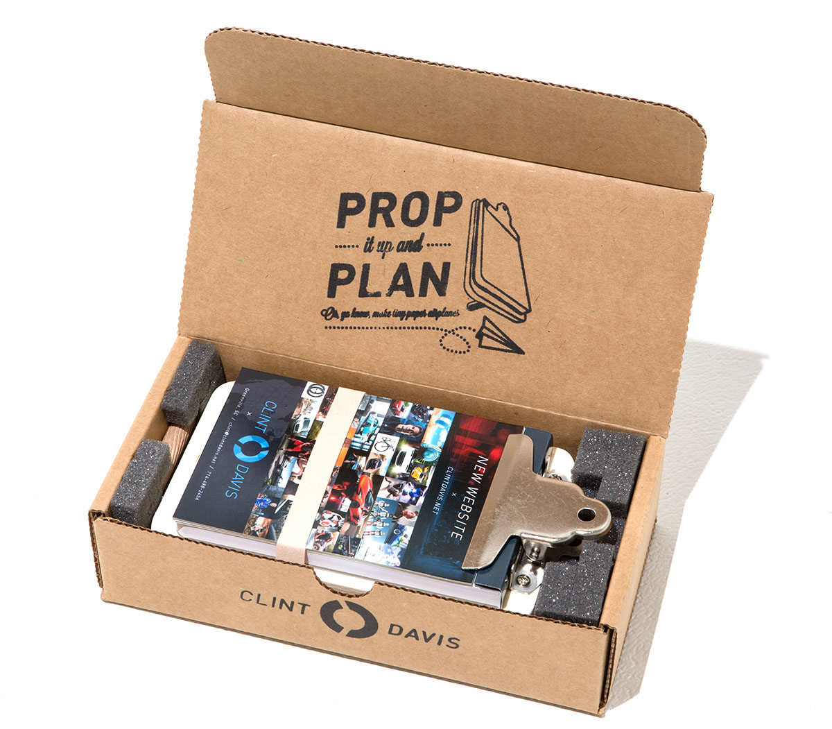
“PROP IT UP AND PLAN” was stamped on the inner-flap to assure the recipient that the clipboard is able to be propped. It’d be a shame to invest all of this time planning a cool promo, yet gets tossed for not being understood. In hindsight, stamping ink on a corrugated box was a bit sloppy considering it bleeds so fast… but at the very least it gives the box a personal touch.
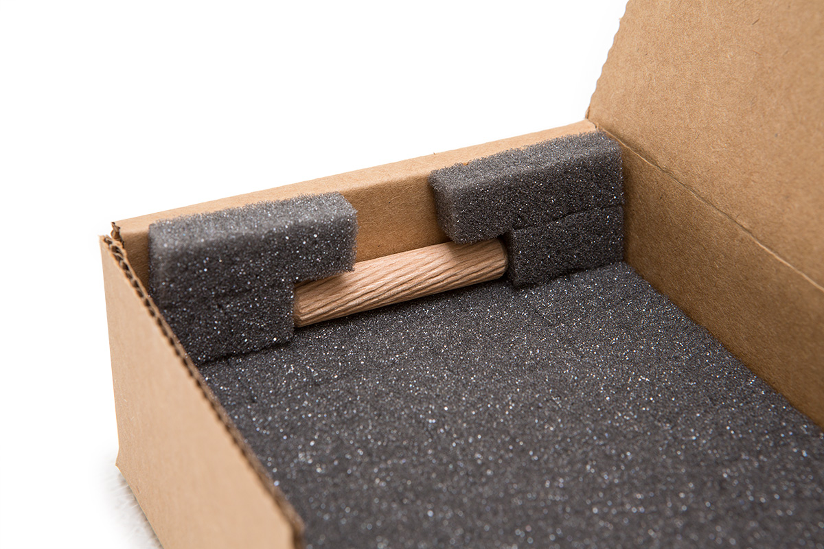
I chose pick and pluck foam to insure the contents were delivered unharmed. This was my clever little solution to secure the stand-up peg. Yes, I know, a little obsessive… but what’s wrong with appearing detail-oriented to prospective clients??
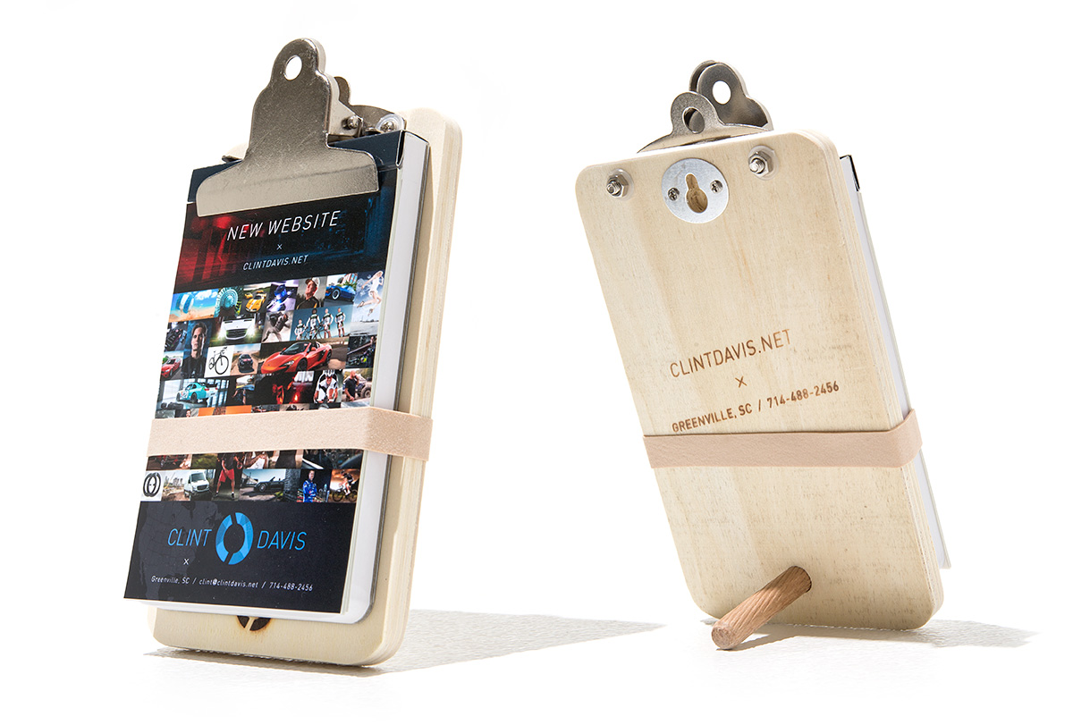
Proudly propped up. Considering the clipboard is the item most likely to be kept from the mailer, I branded my logo and contact information on the wood. The front is subtle with just my logo, and the back has my detailed contact info. Not flashy… just enough.
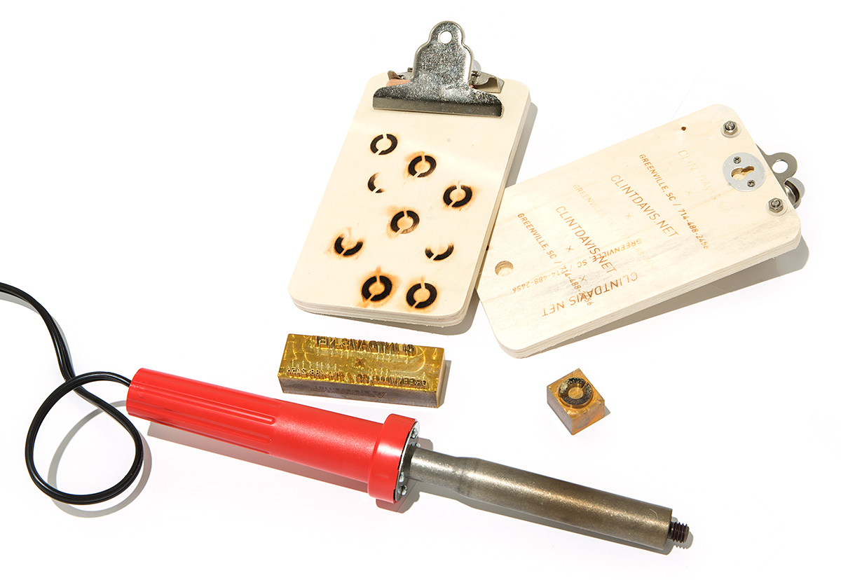
Mmmmmmm the smell of burnt wood. Lots of test runs were needed for the best markings. Too little, and the brand is barely visible. Too much, and the house will burn down. Christina Ramsey, the same artist that painstakingly painted the previous mailer’s bullet shells, did the deed of branding the clipboards.
And there you have it… all of the guts strewn across the floor. As noted before, this promo is nowhere near as ambitious and expensive as the previous mailer, but I’m betting it’s more useful and has a much longer shelf-life.
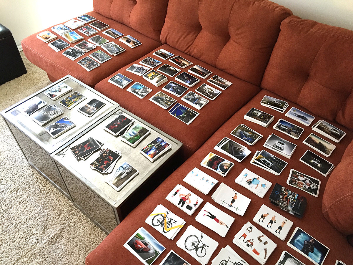
Each promo mailer is going to a different person/agency, so each one gets a unique set of prints.
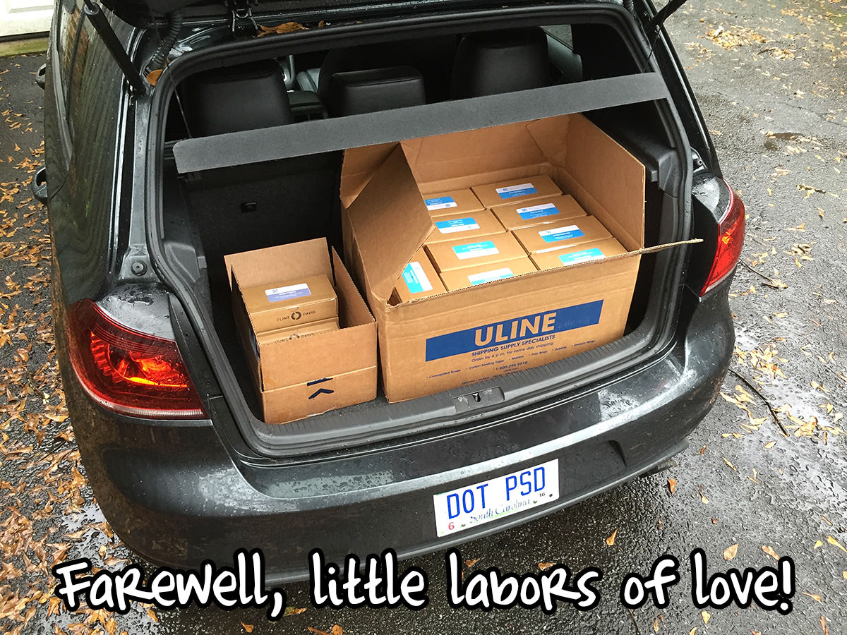
Signed, sealed, and ready for delivery! The total came out to a select group of 50… which is tough to narrow down considering the amount of talented agencies out there. Ad agencies and I definitely have one thing in common, and that’s the mantra that advertising is necessary for any business.