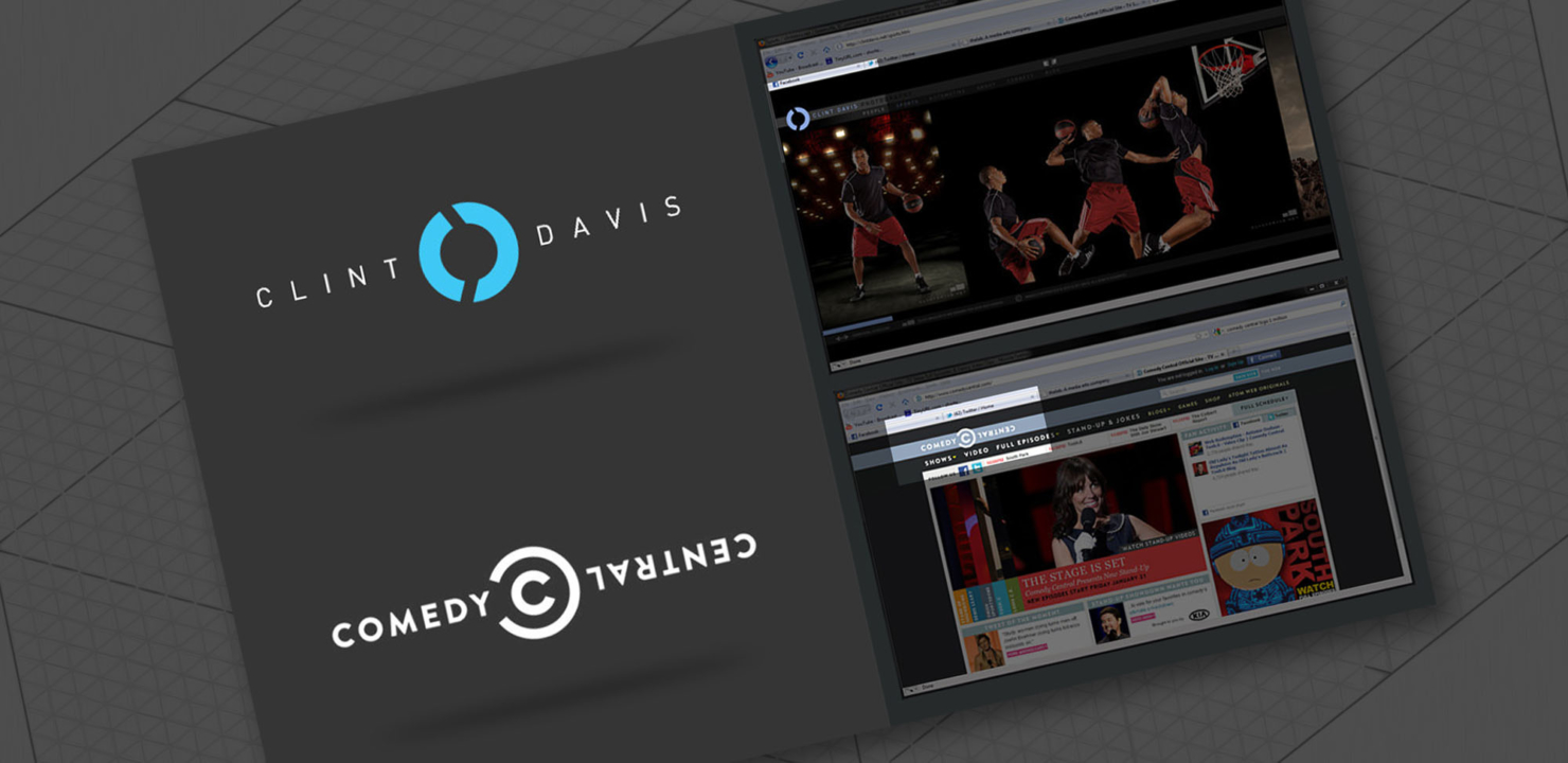
There are a few key channels I watch on cable; Syfy, Cartoon Network, Discovery, ESPN, Speed, and Comedy Central… So you could imagine the surprise I when I saw Comedy Central’s fresh new logo flashing across the screen. Sleek, stylish, simple, serious, ironic? All of the above.
It also looked all too familiar to my logo, but not until I lined them up side by side that really got me flattered. I’m sure I don’t possess the only line-circle-line logo in the world, but the similarities are undeniable.

I know I’m maybe being too narcissistic, but I think the header looks extremely similar to my portfolio website as well. Their primary light blue swatch is also similar to my primary color. I’m thinking someone at thelab (the design firm) at least took a peek at my logo and implemented it somehow. If so, cheers! I ain’t mad at’cha. You have impeccable taste!.. and I’m expecting my check in the mail any day now! 😀 (ha, now that’s a joke worthy of late night stand-up).


